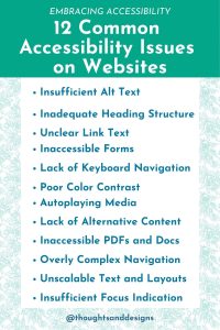
Making sure your website is accessible to all is not just a legal requirement; it’s about thinking about being welcoming and accommodating to others in any way we can. Accessibility is about making your website usable for all, regardless of disabilities and challenges. In this article, we’ll explore some of the most common accessibility issues faced by websites and how to address them.
Common Accessibility Issue 1: Insufficient Alt Text
Of all the accessibility issues I see as a website designer, this is the most common one. It’s also the easiest to fix.
What is alt text? Alt Text is text that describes an image for people who are visually impaired. This way, when they use a screen reader to read a web page to them, they will have some idea of the images on the page.
To write good alt text, make sure your alt text accurately describes the content and purpose of the image. On most website platforms, you can add alt text to an image when you’re uploading the image to place it on the page. You can also go back and edit the alt text later.
Common Accessibility Issue 2: Inadequate Heading Structure
Creating a clear hierarchy of the content on any web page helps the reader know what is most important. It isn’t enough to simply make text bigger, however. I have seen many website owners try to just enlarge and bold text, then call it good.
Instead, a well structured web page or blog post will properly use heading tags (H1, H2, H3, etc.) to break up the text.
Of course, there should only be one H1 tag on any web page, and that should be reserved for the title. However, after that, organize the headings and subheadings with a hierarchy of H2, H3, and H4 tags (or even H5 and H6 if needed), to help highlight the important stuff.
For example, on this page, the title is H1, and most of the subheadings are H2. If I needed to put any other subheadings under my H2 tags to break up these points further, I would next use an H3 tag.
A clear heading structure helps screen readers and all users understand the content’s organization. Websites often have poor heading hierarchy or skip heading levels, which can confuse users, and complicate automatically generated navigation for screen readers and other assistive devices.
Common Accessibility Issue 3: Unclear Link Text
Over and over again, I tell my clients: “The confused mind says no!”
If someone has to make a choice, and that choice is not clear to them, they are going to say no, or avoid making the choice.
If you want people to easily browse your website and find what they are looking for, you need to remove as much friction as possible from this task. One simple way to do this is to describe where a link is leading to in the text that links elsewhere.
Non-descriptive link text like “click here” or “read more” can be confusing, and it doesn’t help your SEO either. Use descriptive link text that conveys the link’s purpose or destination. Screen readers use this text to provide context to users.

Common Accessibility Issue 4: Inaccessible Forms
Forms can be a stumbling block for accessibility. Common issues include missing labels, poorly structured forms, and insufficient error messaging. ReCaptcha images on forms can also keep your visitors from submitting forms.
Ensure forms have clear labels, are logically structured, and provide meaningful error messages. Custom error messages and custom success messages can help your visitors know what to do next if they run into problems with a form or if they are unsure if the form went through.
If your visitors are largely uncomfortable with technology, provide all of the assistance you can in the form of simple instructions in the forms, clear labels for each form field, and very clear messages when a form has been successfully sent or had an error. This will keep them from being frustrated, and it will save you and your team time from answering questions.
Common Accessibility Issue 5: Lack of Keyboard Navigation
Some users rely on keyboard navigation due to motor impairments. Thankfully, most website features should be navigated with just a keyboard by default. You can easily test out your own website navigation and website forms to verify you can in fact navigate them using just your keyboard.
The issue arises when you do something “cute” on a website that results in trapping the user in a particular spot on a website until they do something else. Some examples of this include pop up windows that don’t allow you to escape with just your keyboard keys, or using excessive mouse interaction animations on a page which can hinder someone’s ability to navigate with just their keyboard.
Remember, everything on your website should be there for a purpose, and that purpose should help your visitors find what they need quickly and accomplish their goals easily. Anything else is unnecessary fluff that can get in the way of a good user experience.
Common Accessibility Issue 6: Poor Color Contrast
Color contrast, which is all about how one color stands out from another, is important for usability and accessibility in your designs. People with visual impairments rely on proper color contrast to distinguish text and other elements from the background. People with cognitive differences or dyslexia may also benefit from high contrast, as it reduces visual clutter and makes the content easier to focus on and process.
Poor contrast makes content difficult or even impossible to read, hindering their ability to access and interact with the website.
Please note that sufficient contrast doesn’t just mean anything that makes the content stand out, but color combinations that are easy to read without straining. If you’re using obnoxious colors and fancy backgrounds you probably also don’t have sufficient contrast in your colors.
There are some tools online, including Adobe Colors, which can let you know if your color palette has enough contrast in it to be accessible.
Common Accessibility Issue 7: Autoplaying Media
I can’t think of anything more annoying than trying to surf the web in a quiet office while you have a few free moments, only to land on a website with a video that auto plays LOUDLY. Or, landing on a web page that has music playing in the background.
You quickly fumble around trying to find the source of the noise and make it stop, while everyone else in the waiting room shoots you the stink eye.
Website owners, please don’t do this. Autoplaying videos or audio can be jarring and disorienting, especially for users with cognitive or sensory disabilities.
Also, when using media on a web page like audio or video, provide users with clear and easily found control over media playback and mute options.
Common Accessibility Issue 8: Lack of Alternative Content
Those with visual impairments cannot see your videos. Those with auditory impairments cannot hear sound. To make your multimedia content accessible to everyone, provide alternative content for visitors, to help them grasp what your content is about.
For example, share a transcript of your video in addition to the video itself. Turn captions on the video to help those who have trouble hearing. These are just some small ways to make your content accessible to all.
Common Accessibility Issue 9: Inaccessible PDFs and Documents
Many websites provide documents in PDF format, but these can be challenging for some screen readers to interpret. Before you upload a PDF for your website, make sure those PDFs and other documents are tagged and structured for accessibility. The specifics of how to do this depends on the software you’re using to create your PDF.
Common Accessibility Issue 10: Overly Complex Navigation
If there is one topic that turns me into a broken record, constantly repeating myself, is trying to help clients understand that they don’t need to put everything and the kitchen sink in their main navigation. The more things in a navigation menu, the harder it is to find anything.
Complex or cluttered navigation can be a barrier to many users. Ensure menus are logically organized, and use landmarks or skip navigation links to help users quickly access content further down a long page.
Common Accessibility Issue 11: Unscalable Text and Layouts
I started my career in Graphic Design, especially creating layouts for print media. I’ve worked at newspapers designing ads and paper layouts, and I’ve worked for other agencies creating brochures, postcards, business cards, and more. The nice thing about graphic design is this: you create it, and it looks the same no matter who is looking at it.
Not so with web design.
When designing for the web, I need to take into consideration various screen sizes (from cell phones to large screens, and possibly even smart watches), and screen types (touch screen? Keyboard controlled?).
I have to consider whether or not the average user of this site will have updated their computer in the last decade. I’ve had sites where the users complained that it “looked weird” when actually they were all using computers that were 15 years out of date. Yeah, it’s going to look weird in that situation.
To make the website accessible to the largest swath of people I can, I have to ensure the site is optimized for responsive text and layouts. In other words, the font sizes and layout styles change as the screen size does. Furthermore, in case someone with visual impairments needs to increase the font size, I need to create my site in such a way as to not lock in a font size that cannot be changed. I need to set text sizes to be relative and scalable, to help out those who need to adjust the font sizes for themselves. And, in such a case, I need to ensure the layout doesn’t break when someone adjusts the text size.
Common Accessibility Issue 12: Insufficient Focus Indication
Focus, on a website, means a visual indication that you’re clicking on something on the site. This can look nice, but it is also practical. Keyboard users need to see where their focus is on the page. Websites sometimes lack clear focus indicators, making navigation difficult. Implement visible and keyboard-friendly focus styles.
In Closing
By addressing these common accessibility issues, you can make your website more inclusive and user-friendly for everyone. Remember that accessibility is an ongoing process. With tech constantly changing and everyone constantly upgrading phones and devices, you’re never really done with a website design. Regular testing and user feedback are essential to ensure your site remains accessible and welcoming to everyone who visits.


