The Well Conference Website Redesign

Redesigning the Well Conference for Creatives Website

The Well Conference website is a large relational database website, with many moving parts and the added challenge of needing an annual low-tech update. Here's how I helped them.

Tools Used in this Project:

Web Design Project Features:

Introduction

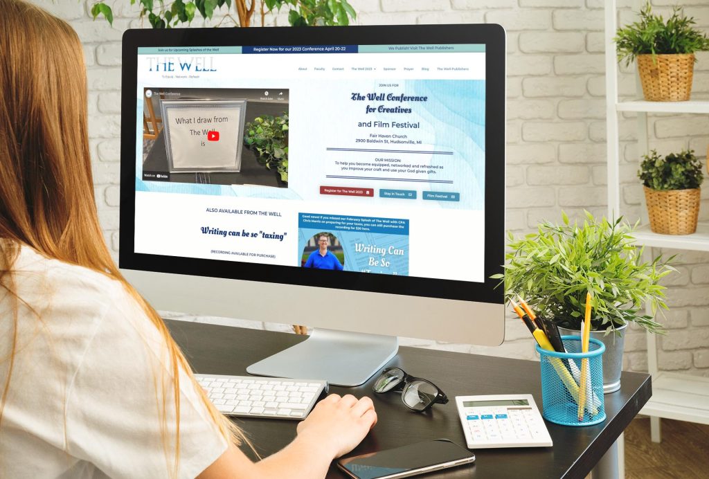
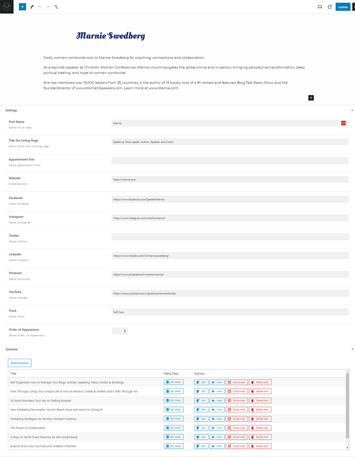
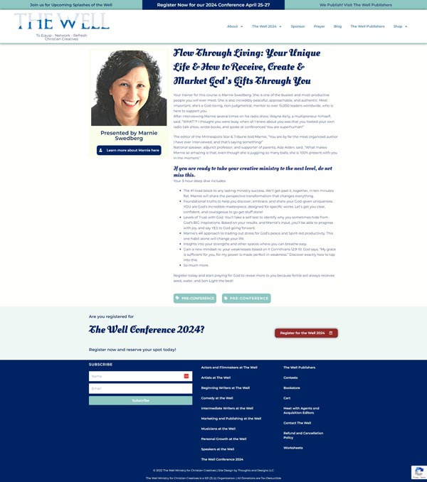
The redesign on The Well Conference website started out as a quick fix on some technical errors on the website.

However, this conference website needed a little more in depth love to get it serving this organization well.

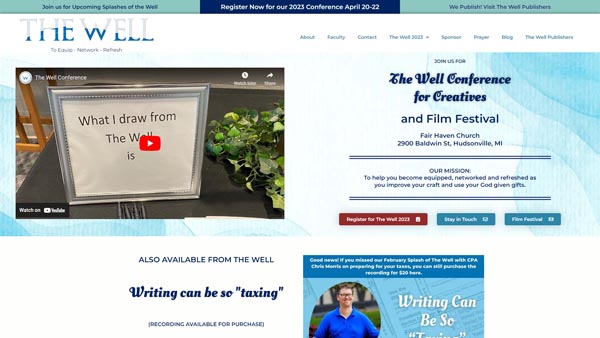
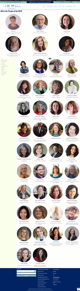
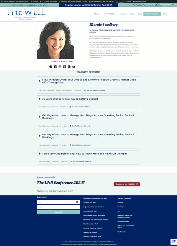
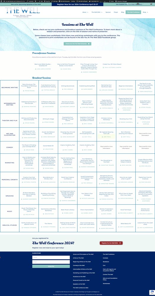
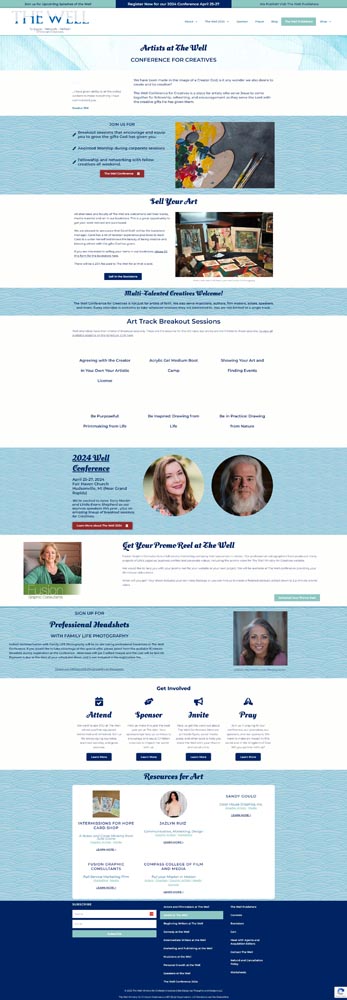
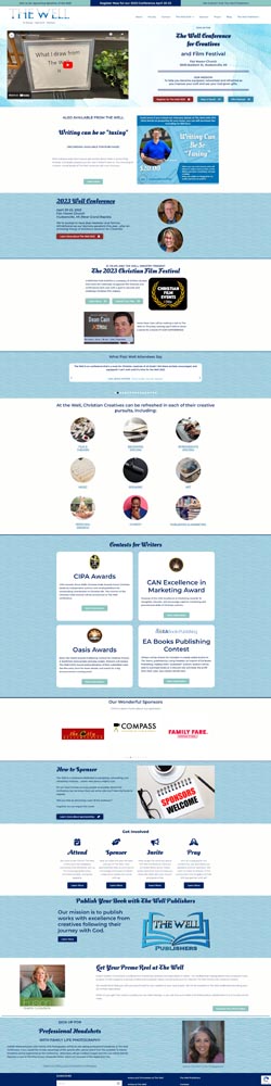
The existing informational architecture (that is, the way content was organized) made it difficult for website visitors to find what they were looking for.

Most of the website’s navigation was found in a series of drop down menus that were so long, they hit the bottom of my large, “designer level” monitor.

The challenge for me was to create an attractive website, appealing to creative professionals and hobbyists, that allowed them to find what they were looking for quickly and with minimal frustration.

Additionally, I wanted to create a site with strong search engine optimization, to help them grow.

Improved Information Architecture

Goal: Re-arrange and organize the large amount of content for better user experience.

This website had a large amount of great content that most visitors never found simply because the content was not organized in a logical fashion. Visitors came to the site with several tasks in mind, including finding out more information about the annual conference (or smaller events), information about breakout sessions, and information about the faculty teaching those breakout sessions. They might also be interested in tips and encouragement for creatives found on the blog or resources The Well curated to help creatives. The Well also needed to highlight the sponsors of their events.

In other words, there are many moving parts that I need to consider when creating an orderly and enjoyable user experience.

Solution: Bringing Order to Chaos

When it comes to a website this complicated, I find you can't go wrong with good old sticky notes on an empty wall. I'm not kidding. I created sticky notes for every feature of the website, every section of the site, and every page they had. Then I spent a few weeks rearranging the sticky notes on a wall in my office to figure out the most logical way to organize this wealth of information, considering the journey most website visitors and potential attendees follow when seeing out The Well.

I improved the information architecture on The Well Conference website for better user experience

Highlighting The Well's Faculty

Goal: The faculty needed to be easily discoverable without being overwhelming

Laying out all of the faculty without overwhelming visitors was my next problem to solve. We didn't want visitors to have to scroll too far. Everyone should be easily viewable on one page, where they could click for more information.

Solution: Masked Images and Filters

Creating a dynamic archive page for our faculty, where any keynote speaker or directors would land on top (with larger listings) was the solution. Each person is displayed in alphabetical order. Website visitors can further filter results by using the filters in the sidebar, where they can filter the faculty by what tracks they are teaching in, or what their positions are.

This page is dynamically created. In other words, when someone creates a new faculty member in the website (using the form above), the person is automatically added in the correct place on the faculty page. The hard part was set up when the website was developed, to make life easier when managing the website.

screencapture-seeyouatthewell-net-people-of-the-well-2023-10-03-09_19_38

Building Connections Between Faculty and their Breakout Sessions

Goal: The Well wanted to highlight speakers and sessions

What's a conference without your speakers/faculty and breakout sessions? For The Well Conference website, a spotlight needed to shine on both speakers and their breakout sessions. Potential visitors needed to know who was going to be presenting at this conference, and what they are all about. And visitors needed to know more about the sessions the faculty were going to be presenting. In the original website, the massive amount of information resulted in a chaotic level of information that was difficult for website visitors to navigate. I needed to remedy that.

Solution: Relationships between Faculty and Sessions

Creating custom post types for both faculty and sessions, and then allowing us to create relationships between those post types in a way that even a non-techie can handle was the first step to making this website function better. The result was individual pages to highlight each faculty member, including links to their important websites and profiles, as well as a linked list to each of their sessions they'll be teaching.

Sample faculty page for The Well Conference: Marnie Swedberg's page shows her bio, her links, and the sessions she's teaching

Easily Viewable Breakout Sessions spanning 7 sessions for each of 8 tracks

Goal: Visitors needed to view breakout sessions relative to the time slots and to other tracks, to choose which breakouts to attend.

In earlier iterations of the site, there were also fewer sessions and fewer tracks. As The Well Conference grew, simply listing the breakout sessions in a list became problematic. A simple list wasn't going to cut it.

Solution: The Breakout Grid

Instead, I created a clickable grid that dynamically loads the titles and facilitators of each breakout session for each track, organized by time slot. This was set up to be easy

for our guests but also easy for anyone on the team to update. The grid doesn't have to be touched at all! While inputting data about the breakout session, clicking which track and which timeslot the sessions belongs to causes it to auto-populate into the grid.

The main downside we have with this setup is mobile-friendliness. I created the grid to scroll to the right as needed, to accommodate the grid without being too small. Although this isn't perfect, feedback from attendees indicates the grid is preferable to the previous list. A note was made on the mobile version of the site, advising visitors that the grid is best viewed on a larger screen, or downloaded as a pdf.

The sessions grid for breakout sessions at the well

Professional, But Easily Editable

Goal: Anyone on the leadership team should be able to make edits

The Well Conference needed a website that could be updated regularly by team members who aren't professional website developers. Thus, user-friendliness was the order of the day. The website needed to look professional, bring a top-notch user experience to life, while at the same time be accessible in the dashboard to non-techies.

Solution: Custom Fields and Dynamic Templates

The faculty pages were created using a dynamic template, so those creating new faculty listings (or updating existing ones) only need to enter information into a form, rather than fussing with the layout, which will automatically pull the new information. As you can see in the image here, the team members need only fill in the information provided, and the template system I set up will automatically pull the data into the user-friendly design.
marnie3

You don't have to do everything in your business yourself.

Let me take your website design project off your already-too-full hands