
Even with the prevalence of “easy” to use, drag and drop page builders for website design, it’s not so simple to create an effective, responsive website. Graphic design and web design are two very different kinds of design. Having my career origins in graphic design, web design can sometimes be a bit more challenging in ways many don’t realize.
When you create a page layout or graphic of some sort, once you create the design it doesn’t move around at all. How it looks for you, is how it will look for everyone.
Web design doesn’t work that way.
Responsive Website Design Presents Challenges Graphic Design Doesn’t
To create a website, especially a responsive website, you need to know more than just how to make something show up on a page.
When you design for the web, you have to take into consideration not only the screen you’re working on, but every web browser (Chrome, Edge, Safari, Firefox, etc.) at that size, and every web browser at every possible size screen, from my monster-sized designer grade screen down to cell phones.
Actually down to smart watches now, God help us.
This is the reality web designers live with. Your design now looks different on each screen. Fun, right?
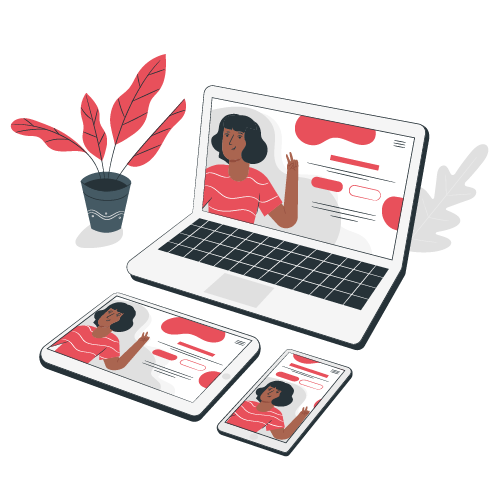
When you hear the term, “Responsive website design”, I’m referring to designing a website in such a way that it responds and resizes to the different screen sizes and web browsers, and looks good no matter which one you’re viewing on. It’s generally understood that a responsive website should function well on any web browser or device made (or updated) in the last five years.
With every website I create, making sure that website is responsive on all screen sizes and browsers is a must. I take the time to plan out how each web page will look not only on a computer screen but also on smaller screens.
I like to think of responsive web design as a challenge to unlock with every website I’m creating. In many ways, that’s exactly what it is.
Responsive Website Design Thinks of the User’s Goals on Each Device

Responsive design begins with the end user in mind. I try to put myself in their shoes, asking each time:
- What would be most important for a cell phone user to do on this particular web page?
- What actions are they taking?
- What information are they looking for?
- How can I make it easier for them to find and accomplish what they are intending?
This really is just at the heart of good user experience design, but with the added layer of thinking about how people use the internet on phones versus laptops or desktops. I believe truly responsive design has to be more than just making a website smaller so it fits on a screen. The website has to be functional on the device I’m designing for.
This includes making sure items on the page are not too small or so close together that it becomes difficult to click on links or buttons. On mobile phones, pages need to load faster without too much bandwidth, so images need to be smaller and the page needs to be optimized to load faster in every way possible.
Responsive Website Design is Not Just “Shrinking to Make it Fit”, but Problem Solving
Some design situations make it especially challenging when trying to make it work on a mobile phone. A professor used to drill into us that designers don’t create art; designers solve problems.
Responsive website design often presents problems we need to solve.
One recent issue I faced involved a schedule I created for a conference. The idea behind the schedule was to make it easier for conference attendees to see, at a glance, all of the break out sessions in all of the tracks, so they could easily plan their time. A simple list didn’t work as well, as you couldn’t see all of the tracks and all of the times.
My solution was to create a grid showing the times across the top, and the tracks across the left side. In each cell under the times was the break out sessions for each track. Each breakout was clickable, so the attendee could learn more about each breakout session.
The problem was on mobile.
There was no way to create such a robust grid so that it fit on a mobile screen while still being readable and clickable without it scrolling to the right.
The solution, though imperfect, was to allow the grid to scroll to the right as needed on that page, while informing mobile visitors that the page was best viewed on a larger screen, or by downloading a pdf of the schedule, which I had linked there.
Despite that issue, most of the attendees said they preferred this layout to the list view that used to be on the website, because they could see all of it at a glance, just not on their phones.
Sometimes that’s just how it goes.
Responsive Websites and Older Devices
Age of devices and web browsers can also get tricky. If you happen to have some website visitor who hasn’t updated their computer browsers since the last president was still in office, things are going to appear broken for them, because not every older device can handle newer websites. And not every newer device will render an old website correctly either.
Once, after I created a really amazing website for a community group some years ago, a woman in our community told me that it would look better without the huge photo at the top. I didn’t know what she meant. There was no huge photo at the top.
After she took me inside her house and fired up her computer (which looked about 20 years old), I saw the issue. Her computer was so out of date, it couldn’t detect the rules I had set for displaying the background image. It didn’t know what to do with it, so it just plopped it up there at the top.
Since that time, I’ve made sure to set responsiveness rules for some elements of a website so that they will simply not display if someone is viewing them on a web browser before certain versions.
The point I’m making is this.
You’re not just designing for people with a shiny new iPhone. You’re also designing for older folks who aren’t as comfortable with technology, and people who don’t ever run updates. For this woman, her computer hadn’t had an update since 2005 because she didn’t know what those warnings meant, so she thought, better safe than sorry.
“But,” I inquired, “Are you able to really browse the internet like this? Do websites look really weird to you now?”
She didn’t really understand what I meant, but did say, “Well, a lot of people are making websites with big pictures at the top and wording all on top of each other. I don’t know why they do that. More and more websites look like a mess.”
She thought it was website designers deliberately creating lousy looking websites for who knows what reason, rather than equating it with her very out of date system not being able to read modern websites. I find myself talking many website owners out of having too many brand new features if they have a predominantly older audience. Sometimes user friendly is more minimalist.
Sometimes your audience includes people who have let their computers go without updates for so long, modern web design code will not work on them. If you know your web visitors are of a certain age, and not very tech savvy, then part of making the site responsive will include not adding too many fancy bells and whistles which may do strange things on an older system.
