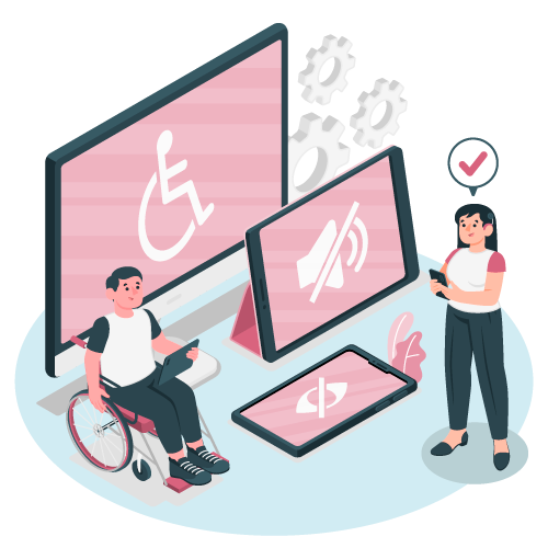
Website accessibility is becoming more important in general, now that many courts have agreed that the Americans With Disabilities Act (and similar laws) apply to websites too.
I suppose it could be said this has always mattered to those with disabilities who have to learn to navigate both the real world and the virtual one within their limitations.
And I would also add that accessible design is just good design in general.
It’s good for those using assistive devices to browse the internet, it’s made with best practices for web design, and it’s created in such a way as to help search engines like Google index your website better.
Accessible websites are just good design.
But let’s dive in further, shall we?
This way, they are not just putting blog posts up that may not be optimized for those with disabilities.
How does website accessibility design work?
Whether you use a pagebuilder or you code your website by hand, old-school style, when other technology interacts with your site, they are not just interacting with the visuals. They are primarily interacting with the code.
The technology interacting with your site may include:
- Search Engines
- Website Browsers
- Assistive devices for the disabled such as screen readers and closed captioning for audio.
The code, to put it simply, tells the website browser (like Chrome or Edge or Firefox or Safari) what the website should look like, and the browser then displays it like that.
The code also tells various assistive devices how to describe the website to a visually impaired person, for example, and it allows people to navigate the site easier when they are unable to use more common technologies like a mouse or touchpad.
If the website looks great to you but isn’t set up properly from the standpoint of these assistive devices, then it isn’t accessible to those with that disability.
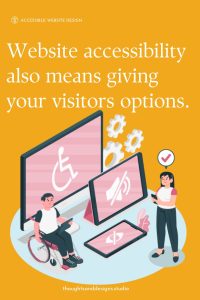
Website accessibility also means giving your visitors options.
For example, when someone is deaf or has trouble hearing, requiring a phone number on a form is a terrible idea. It’s a terrible idea anyway since most of us are online because we’re not ready for a phone conversation, thank you very much.
Instead, giving options such as including a checkbox to indicate how you prefer to be contacted would help make your site more accessible.
If you use two factor authentication (2FA) on your site, make sure there are multiple options for that, rather than just receiving a text. Why? Because I used to live in a cell phone dead zone, and I’d need to drive up the road a mile to get my 2FA code, then rush back home before the code expired to finish logging in. I’m sure I’m not the only one.
Accessible websites also place clickable elements like buttons far enough apart so that someone who struggles with motor control can safely click the buttons with minimal frustration.
These are just a few examples.
How the Visually Impaired Surf the Web
Well the tech is really cool to be honest. I’m amazed and thankful that people have considered those with different disabilities, including the visually impaired, and have made a way for them to also enjoy the visual medium of the Internet.
For the visually impaired, they use screen readers to browse the web.
Pretty neat, right? The 21st century is a good time to be alive, despite the problems we still face.
But there’s a downside.
Assistive Technology requires a well structured, accessible website design
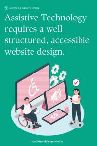
If someone doesn’t create a well structured and accessible website, the screen reader cannot tell the person using it just what they should be looking at.
Most of these issues are completely invisible to those of us who have good eyesight. They involve the semantic markup of the website’s pages (that is, the code part of it), mostly the alt tags, the headlines and subheadlines.
Those are issues I have to educate clients on frequently.
I had a blogger client who was paying me to fix some issues on her website. At some point while poking under the hood, I realized the structure of her posts was not at all accessible to anyone using a screen reader, and not SEO friendly to boot.
I explained the importance of using the heading designations (whether HTML tags themselves or selecting the H2-H6 in the editor in the Post Edit and Page Edit parts of the WordPress, WIX, or Squarespace Dashboard).
She had been using the editor to make text bolder and bigger instead of using the headings.
“Yeah, but it looks the same. What’s it matter?” she said.
Accessible website design isn’t always noticeable to those not using assistive technology
When it comes to accessible websites, the structure matters a great deal.
The headings provide the basis for a table of contents, allowing someone with a screen reader to jump to the information they want.
The headings help search engines know what the information is about. The semantic markup is the code that tells web browsers and assistive devices which text is headings, and what level of headings, so the screen readers and other assistive devices can help the disabled navigate these sites.
The bold and enlarged body text may look the same as the h2 heading, but the machines such as screen readers and search engines read it completely differently, to your detriment.
Alt tags on images are also important. These tell the person using a screen reader what the image is showing, so they know what it is.
When you upload an image to your blog or website, you have the option to add alt text to the image. You may have not even noticed the little box for it. But just adding something like,
“Decorative image of a woman and child going for a walk”
can help improve the experience of your visitors using screen readers, and they can help search engines understand your website and (hopefully) share it with those searching.
Yes, there are accessible website plugins
You might have noticed there are plugins that create an “accessibility overlay” of the website to improve the accessibility of a website.
These can help, especially if you live somewhere that requires legal compliance. But they aren’t perfect. I’m not going to go into it, but go on Reddit and search for one of those better known companies by name, and see what many disabled people actually think about them. Yikes.
However, a well built website is always a better option, not only for accessibility but for search engine optimization too.
So, how accessible is your website?
If you’re curious how your website accessibility stacks up, I have this great checklist for you to use to audit your own website – just use the form below. This isn’t a comprehensive list, just the most common issues I see. For a comprehensive list you can visit the WCAG guidelines here.
